My Written Reflection Part Five

I have really enjoyed Part Five of the Course because I had a sense of things coming together for me.  I found my drawing improving with this being a major challenge for me at the beginning of the Course.  I understood how to drill down on a theme and focus on a few elements and the ideas kept coming and still are coming.  Importantly I found I had more organisation and structure to my work.  I think the analysis at the end of Part 4 on “A Structured Approach to Reflective Thinking” leaning heavily on the work of Cottrell(2011,p211)help me to approach Part Five in a more cohesive way.

The model I presented of critical reflection encouraged me to do a “Review of Formative Feedback”(blogpost March 30, 2017) for assignments 1, 2 and 3, for example the question I posed to myself in terms of Assignment One Feedback “Have I looked hard at other practioner’s work and fed that into my own practice? provided me with a prompt as I commenced Part 5 to ensure I documented my Research of other Practioner’s who I was drawn to (e.g. Dorothy Caldwell, Bobby Britnell).  The reminder to draw in a range of mediums, to draw without looking on large A2 paper all were highlighted to me.  I also did an update of the book “Steal like an Artist”.  The review of the feedback from Assignment Two also encouraged me to include more photographs from my sketchbook,and to use to water soluble crayons and other materials.  I took on board the feedback from Assignment Four also and revisited Debbie Lyddon’s Book and provided more in-depth analysis.

In terms of my Model which is a continuous loop Model I followed along on the Acting and Experience by research gathering and documenting this, by preparing a portfolio of work.  I reflected on my previous creative experience in Assignments 1,2,3 and 4 and my current experience.  I tried to integrate my reflections with ideas and approaches by other artists and I think I achieved this at least to be influenced by Caldwell, Britnell, Blake and Streefkerk in Part 5. Review and Assessment I will comment further below and finally evaluating in terms of my development.

Overall for Part 5 I have had a shift in my thinking about my textile work.  For the first time I feel a deeper relationship to my subject matter to what I am doing and how I am doing it in some way it feels part of me.  It is not just a selection of techniques it is more than that.  I have also come to value the use of the sketchbook (I have to confess I was trained by a master US quilter to work intuitively with no sketchbook)as my place to sort out ideas and experiment I still have work to do though.  I think I better managed my time in Part 5 but there is still room for improvement.  I understand so much better now what I need to do than when I started the course.

The course in general has provided so much to me in way of my textile work.  I feel so enriched by the experience.  I now approach my work from a deeper mindset.  This has had a very positive effect on my other textile work outside of this course.  I plan to enrol in the Mixed Media in Textiles Course next.  I will enter Exhibitions also (I have done this already) but be more experimental and less risk adverse with my approach.  The course has stimulated me to think of textiles far more broadly and I look forward to expanding in this context further.


Assign 5 Part 5 Review against Assessment Criteria

Demonstration of technical and visual skills – materials, techniques, observational skills, visual awareness, design and compositional skill (40%)

I think I have followed the requirements of the Projects and Assignment and enjoyed the experience.  I have built on the work in previous Parts of the course in the undertaking of these works. I pushed the use of different materials in my work and to test their usability e.g. the Art Tissue paper.

Quality of Outcomes- content, application of knowledge, presentation of work in a coherent manner, discernment, conceptualisation of thoughts, communication of ideas (20%)

I think my outcomes are satisfactory.  I realise that there was a lot of freedom to interpret what was required in Part 5 and Assignment 5 and I hope I have followed a reasonable path,


Demonstration of Creativity – imagination, experimentation, invention, development of a personal voice (20%)

I have used some sketching to study my yarn approaches and in looking at my Tropical Tourist items.  I have used a variety of sizes including A2.  I have used a variety of materials e.g. crayons, wire

My approach to 5.3 to create experimental materials and printing to form the basis of my textile collection and my yarn development 5.2 I think showed my willingness to be  experimental.  Creating the six samples for my Textile Collection really felt like I am starting to develop my personal voice, how I really felt and related to the subject matter and my own way of interpreting the subject.

Context – Research, reflection, critical thinking (20%)

I have documented the Artists I have researched in Part 5 who have influenced my work and commented in My Written Reflection blogpost of the impact of these Artists.  I have established several Pinterest pages on these Artists and others.

I have approached my work in terms of my Model of Reflection as discussed in my blogpost My Written Reflection blog post of 30 May 2017.

Part 5 – What have I done?

Before I undertake my Written Reflection I have decided to document as an Index the work I have documented in Part 5 on this Blog.  I have also used a sketchbook.

BLOG POSTS AND DATES – PART 5 AND RESEARCH AND EXHIBITION WRITE UPS


  • Assignment 5 – Textile Collection                                                              30 May 2017
  • Part 5 Project 3 – Experiments and Taking Risks                                   30 May 2017
  • Research:   Dorothy Caldwell Textile Artist                                            16 May 2017
  • Project 2.4 – Develop yarn and linear concepts                                      16 May 2017
  • Research:   Bobby Britnell Textile Artist                                                  04 May 2017
  • Project 2.3  –  Develop Textile Concepts                                                    03 May 2017
  • Research:  Sally Blake Australian Artist                                                   03 May 2017
  • Exhibition Queensland Art Gallery O’Keeffe, Preston                           03 May 2017
  • Project 2.2  –  Inspired by Artist                                                                  28 April 2017
  • Project 2.1 – Building a Colour Response                                                  18 April 2017
  • Project 1 – Drawings                                                                                      17 April 2017
  • Exhibition Visit to National Gallery of Australia                                    11 April 2017
  • Research:  Hannah Streefkerk Textile Artist                                           01 April 2017
  • Exhibitions: NERAM                                                                                     30 March 2017
  • My Review of Formative Feedback Assignments 1,2 and 3                  30 March 2017
  • Yarn File:  Selvedge Magazine #75                                                             29 March 2017
  • Research:  Cas Holmes – Mote Tree and Collage                                      27 March 2017
  • Research:  Follow up Debbie Lyddon Book Tutor suggestion              27 March 2017
  • Tutor Feedback Assignment Four                                                              20 March 2017
  • Book:  “Steal like an Artist” Notes                                                               10 March 2017
  • Research:  Glenys Mann Textile Artist                                                       05 March 2017
  • Part 5 – Reflection – How to look at Textiles                                              04 March 2017
  • Part 5 – Reflection Laboratory versus Factory                                         28 February 2017

Something to think about to assist my study work in  the future is why there are some periods without posts being blogged could I have made better use of my time? Have I documented enough of my Research? Have I taken time to reflect or to comment during the work for Part 5?

Assignment Five – A textile collection

In Assignment 5 I need to work to create a collection of at least six samples which do not have to be final but rather an opportunity to improve upon my experimental samples.  The samples should be a minimum of 30cm by 30cm.  I have interpreted this to mean that if something is rectangular than the total area must be in the vicinity of this measurement.

I have decided to confine my colour choices to orange/yellow/ochre/rust/ generally with black and white.

SAMPLE ONE

I wanted to take the mono printing approach further but to change the substrate I used in 5.3 experimental pieces as a further challenge to myself and to reflect in this first sample the delicate nature of the bougainvillaea flowers so I chose Art Tissue Paper as my substrate – it is very fine but strong and can be stitched into.

first I mono printed using the gelliplate and textile ink I drew with the back of a paint brush into the textile ink to depict the thorny nature of the plant.  I then back printed in black textile ink the same thorny branches of the plant.

Next I painted my gelliplate with black textile ink and used a makeup wedge type sponge to remove paint to depict the bougainvillaea petals using once again the art tissue paper.  This approach had the advantage of ensuring some paint was left to show interest in the actual petal and the papery type effect of using art tissue paper.  I attached a section of the black and white petals mono print to white felt using bondaweb and then decided to adhere to my background ‘fabric’ which had also been attached with bondaweb to white felt.  I decided to stitch the ‘petal piece’ to the background fabric using a primitive type stitch which in some way reflected the thorns on the plant.  I was not happy with this piece as the petals dominated the work.  So I mono printed some more paper fabric using a curvy type mark and auditioned it to the background piece see the series of photographs below I was not happy with any of these approaches.  Next I thought more about my subject and decided I should depict further the thorny branches in a mono printed piece in combination.  This did not work for me either it just looked like three pieces of fabric appliquéd on.  So in the final piece I used the thorns in the vertical and horizontal and attached to the felt and then stitched using the same primitive straight stitch as I had used in the petals.  I left some overhang at the bottom also.


SAMPLE ONE – FINAL PIECE size 37cm by 35cm

IMG_8758SAMPLE TWO size 21cm by 51cm

I have once again chosen the Art Tissue Paper to mono print the petals of the bougainvillaea using black and white textile ink and my makeup sponge wedge for the petals.  The gelliplate is a fixed size so I had to do more than one print to gain enough paper fabric to work with.  I decided to use some of my procion hand dyed fabric (I dye fabric using low immersion technique and several dye colours so as to obtain interesting colour variations)which I freehand cut and appliquéd to several mono printed petals,  I then machine outlined these petals using a number 50 weight machine cotton thread in orange.  I used a haphazard type zigzag to sew around the edges to secure the paper fabric to white felt(which had been bondawebed).  This piece captures the fragility of the bougainvillea petals and the colour.

IMG_8759

SAMPLE THREE size 38cm by 38cm

In Part 5 Project 2 I undertook a series of pieces based on my chosen artist Georgia O’Keefe and in doing this influenced by her painting of “Sunflower” 1935 I carved a stamp using easy cut rubber and printed on newspaper.  For Sample Three I have again taken this stamp and using variations in colour from yellow to deeper orange I have stamped the sunflower on canvas that I have covered in gesso (like my experimental pieces in 5.3 experimental pieces 2.  I decided to go back to using eyelets like I have used in Part 4 yarns and in Part 5 yarns and place a similar colour eyelet in the middle of some of the stamped pieces.  I did not want to do more work on this piece but mounted it on white felt.  I think it has lots of movement and interest without adding even more embellishment.  I think I am a minimalist at heart!

IMG_8761
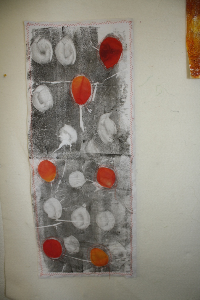
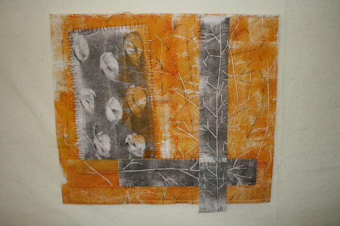
SAMPLE FOUR -size 28cm by 38cm

This piece is designed to reflect the earth the bougainvillea grows in and the colours of the petals.  I have mono printed with the gelliplate on canvas which has been gessoed using textile ink. I have rubbed earth (influence of Dorothy Caldwell – in my Research) from my garden into the bottom of the piece.

Why?  My thoughts are I seem to be driven by the Part One exercise – Tropical Tourist and my further work in Part 5.  I think that hose ‘talk’ to me I can relate to place where I live, my country, my State and colours and climate, to the peoples of this land – the Aboriginal peoples of my childhood – the colours of the earth and the contrasts of the bright hibiscus and bougainvillea, the bright greens, the yellow greens, – the sunlight – the blue of the sky.  Our land and ancient peoples in Australia have a deep history.  This has inspired me to want to do more earth dyeing and natural dyeing (my research piece on Sally Blake’s work with eucalyptus) and to research more on the basket and dilly bag making of the Aboriginal peoples.  To consider free form weaving using these colours.

I have added some hand stitch to the colour squares and at the top and bottom I am still wondering if I should continue the stitching all over the piece I am not sure.  Also whether to couch a red ochre thread in a loop I am not sure.  Maybe the simplicity is enough.

IMG_8763

SAMPLE FIVE  size 36cm by 41cm

This piece is based on my photo in 5.2.3 yarns with the hibiscus flower which was past its flowering.  I made the background using a piece of white linen and then printed directly onto the fabric using textile ink with a roller and underneath textures e.g. corrugated cardboard.  I tea dyed some cotton with a herbal hibiscus and another flower teabag and some ordinary teabag this showed the decay that was starting to occur with the hibiscus flower petals.  I free cut an dappliquéd the petal shapes onto the linen deliberately enhancing the size of the actual petals by about 100 percent.  I considered how to add more depth to the piece and decided to attach by machine narrow textured ribbon in solid black.  I then machine outlined the hibiscus petals using grey thread.  I was not convinced the grey thread was standing out enough so added some more machine stitching using black thread.  I attached the linen to white felt and machine stitched around the edges in black.  I am still mulling over this piece I am not sure I have placed the appliqué shapes in the right order – should the biggest petal  be in the righthand corner or should it have been place in the bottom left hand etc.

IMG_8769

SAMPLE SIX – size 31 by 36 cm

You will recognise the extension of the sample I made in Part 5.3.2 experimental using canvas with white gesso.  I again attempted to mono print using the bougainvillea petals and two layers and this time I achieved more contrast in the colours than in my sample.  I wanted a rugged piece of background fabric because I wanted to use the wire yarn I had made in Part 5.2.4 of the bougainvillea leaves.  I needed a fabric that would support the wire yarn.  I pondered how to attach the yarn and tried staples (that did not work) and then thread.  Using several strands of thread I could attach my yarn to the canvas.  I am happy with this piece because I met my challenge to myself to use some experimental yarn as a design element in a fabric piece.

IMG_8770Here is a photo of all the pieces up on my design wall (really just polystyrene and some thin batting!).

IMG_8746I will write my Written Reflection to Part Five in a following blogpost.

Part 5 Project 3 Experimenting and Taking Risks

In this Project I am focusing on experimentation with methods and materials.

I have decided to focus on the materials and base for my future work. I worked through my approach using my sketchbook.  This is my first page where I am documenting my initial thoughts and linkages.

IMG_8751

I am drawn to the bougainvillea which is in my Part 1 Tropical Tourist living collage. I found the delicate flowers and then the very sharp thorns a contradiction.  I drew a pencil sketch of the plant as I was considering my options for experimentation.IMG_8753

In my sketchbook I then made a list of options for the background materials I could consider which were experimental see my photograph of the sketchbook page below.  I also used the design elements framework to brainstorm ideas.  I considered some of my source materials such as my drawings, mark making, photographs, rubbings and my yarns.IMG_8754

In my sketchbook I made a colour collage to encourage me to think about what colours I might use in the Project. This is shown below.  I also questioned myself about what threads I might use and embellishments and most importantly what I thought the emphasis might be.  As I have indicated earlier in ATV I tend to think and think and think about a piece of textile work but do not document I consider the types of issues I have documented in my sketchbook but have not written down.  Encouraged by my Tutor I am training myself to approach my work this new way documenting in my sketchbook.IMG_8755

I next considered my possible design tools and approaches and these are documented below.IMG_8757
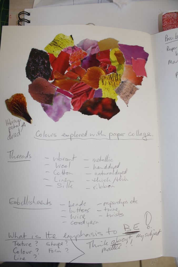
Having undertaken this documented approach and due consideration to my experimental work I next decided to make the samples based on my experimentation being the materials and mark making for the background work for Assignment 5 with the restricted colour palette informed by my colour collage work in my sketchbook.


I have put my samples into my sketchbook some are bigger than the sketchbook but that is alright.

Experiment 1  Rubbing on my procion dyed fabric using the skin of the pineapple used in the Photograph Collage of the revised Tropical Tourist (photographs in Part 5)IMG_8702

Experiments 2 a, 2b, 2c – are made on canvas which I have painted with gesso

2a – mono printing – gelliplate printing with bougainvillea petals  using textile inks using a second layer of printing

2b – is back printing using textile inks on the gelliplate of bougainvillea thorns

2c – is black and white texture using direct printing with textile ink with a rack from the dishwasher underneath

IMG_8703

I like the roughness of the gessoed canvas and the texture it creates on the prints.

For Experiments 3 I used kona cotton to which I applied white gesso.

Experiment 3.1 – the same type of experiment as Experiment 2.1 with the mono printing using a gelliplate and textile ink with two layers.  The result was much denser and smoother with more solid colour

IMG_8704

Experiment 3.2 uses the direct printing method with textile ink using roller brush and wire dishwasher rack to make marks.

IMG_8705

Experiment 3.3 I used cut out paper petals larger than the real bougainvillea petals and did a light print over with textile ink on the gelliplate.

IMG_8706

Experiment 3.4 I depicted the bougainvillea thorns using back printing using a skewer and textile ink on the gelliplate the same as for the canvas piece 2.b  I particularly like back printing as a technique because it leaves background noise on the surface which gives it a painterly effect.

IMG_8707


Experiment 4 Next I printed directly onto COTTON fabric.

Experiment 4.1 shows the back printing using a skewer done directly onto the cotton fabric (i.e. NO gesso) it comes up really well too.  Still using the gelliplate and the textile ink as in Experiment 2b and 3.4.  Similar results so it depends how much say hand stitching one might want to do or it it was to go into a textile piece with other dyed cotton fabric for example.


IMG_8709


Experiment 4.2 once again the real bougainvillaea petals mono printed using the gelliplate with textile ink.  Has lots of potential for hand stitch, art quilts or just quilts.IMG_8710


Experiment 5 – cotton fabric with direct free printing and mark making using cardboard edges.  I drew the bougainvillea petals and the stalk using intense block colour and then added water.  I don’t like this effect it looks basic and I much prefer the layering of textile ink or appliqué fabric.IMG_8711

Experiment 6 – Inktense blocks on cotton with water added.  I gave the inktense blocks another go using mark making and liked this better as a background fabric which could be cut up and repositioned to create more interest.E

Experiment 7 –

7.1 – Canvas with white gesso applied.  I then painted textile ink in a grid onto the surface.  This makes a bold statement.

7.2 – I took pellon (or what we call pellon in Australia) and dyed it with procion dye. It is soft and would be particularly good using needle felting or an embellisher machine

Experiment 8 – cotton fabric with back printing using a gelliplate and the back of a paintbrush. Was really just looking at how a lighter colour would look with the back printing.  It is subtle but may be good for a background fabric.IMG_8750
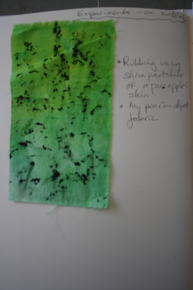
I think that my Experimental textile samples will be very helpful for my approach to Assignment Five.

Research: Dorothy Caldwell Textile Artist

I have long been drawn to the work of Canadian textile artist Dorothy Caldwell whom I met in New Zealand some years ago.  I like the ruggedness of the work the detail of the mark making and the addition of stitch and appliqué in many of her works.  I appreciate the story behind the works. The photograph taken of the cover of a recent Studio Art Quilters Associates Inc Journal shows to some degree the scope of her work. This work A Red Hill/A Green Hill is 9 feet 3 inches x 9 feet 6 inches.

SAQA COVERDorothy recently did a series of work based on using earth to dye her fabric.  She undertook residencies in the Australian Outback and the Canadian Arctic.  Her process was to fill many small journals with images, drawings and paper dyed from natural sources thus recording fragments of the places she was studying.  Many of Dorothy’s art pieces are large as evidenced in the Cover photograph above. She references objects she finds on her walks in these remote areas and indigenous art.  Dorothy sees the stitch as very important to the mark making seeing it as a dot, a line and a texture.  The stitches are like running stitch, kantha stitch, darning and mending stitches  and she is quoted as being inspired by this Louise Bourgeois quote:

“I have always had a fascination with the needle, the magic power of the needle.  The needle is used to repair the damage.  It’s a claim to forgiveness.”  Louise Bourgeois

Her technique outlined in the SAQA Magazine (2016, No4) journal article is to first create the base cloth using printing, wax resist, and discharge and dyeing.  With the base complete she hangs the piece on the wall and continues by adding appliqué, stitching, and drawing with thread.  The work created is powerful and connected to place.

Dorothy’s work inspires me to want to travel to Outback Australia (I have never been) and see for myself the red ochres of the earth and try dyeing fabric with the earth.

ADDED FOLLOWING FEEDBACK FROM MY TUTOR

Dorothy is a Canadian artist and I have not been able to see her work in person much as I would have liked to.  What draws me to her work is the subtle colour scheme she often uses in many of her works, the bold large shapes and the way she uses stitching to add to the texture of the work.  She creates a story with each large piece and that is something I find difficult to do –  to create the feeling and the atmosphere in a textile work it is something that I aspire to do and adds to the richness of a piece in my eyes.  The bold large shapes in the piece pictured above create immediate impact and draw the viewer I would imagine from across the exhibition room.  The smaller areas of colour add movement to the piece I particularly like the small green pieces and the fact that they are    mottled colour.  The way the green colour is depicted in this uneven way adds more interest for me to the piece.  I note that she also subtly varies the shading of the neutral large areas on the above work and this adds I think to the complexity of the work.

Reference: 

SAQA Journal 2016/Volume 26, No4

http://dorothycaldwell.com

https://en.m.wikipedia.org/wiki/Dorothy_Caldwell

Part 5 Project 2, 2.4 Develop yarn and linear concepts

I enjoyed exploring yarn development and design in Part four and in Part Five I have to employ these approaches to develop yarns and linear concepts also working on my textile concepts.  I need to develop at least six to eight yarn concepts.

I first drew some ideas in my Sketchbook influenced by the colour and nature of my hibiscus and frangipani flowers in my Tropical Tourist composition.  I was looking to use approaches that were different or built on my yarn work in Part 4.

yarn sketchbook page
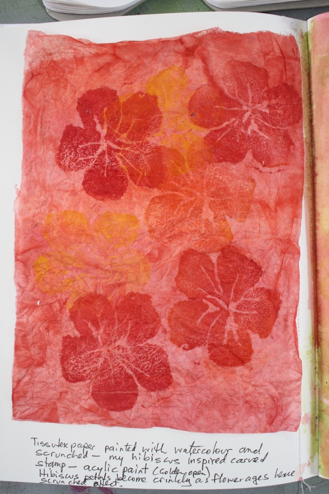
I decided to paint paper with watercolour paint to form part of my paper yarn collection.    Next red acrylic paint was used on decovil and also on bondaweb this reflects the colour of my frangipani and some hibiscus and also my Georgia O’Keefe theme of red as discussed earlier.

Paint and bondawebI cut the copy paper I had painted with orange and red watercolour paint into sizes around one quarter inch wide.

Yarn 1
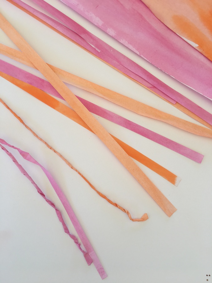
I then finger twisted the paper using my index finger and my thumb to make uneven type twists.

These paper twists were plaited.  I like the organic nature of the twisting and the possibilities for development into three dimensional and two dimensional work.

Yarn 2I also used the twisted paper yarn to make round flower like shapes on a background of two strips of the painted paper.

Yarn 3Here is a photograph of the pieces and my colour inspiration a hibiscus flower which has finished flowering.  I love the texture of the hibiscus flower petals it is crepe like.  I was happy with the way my coloured paper yarns reflect the colour and texture to some degree of the spent hibiscus flower.

Yarn 5The next piece uses the bondaweb which I painted with the red acrylic paint and then using an iron adhered to white cotton.  I then created a frangipani stamp quickly using adhesive foam and stamped several petals onto of the adhered bondaweb.  I sewed the piece together using a machine embroidery stitch for extra texture.  This technique has endless possibilities but maybe not so much as a yarn.

Bondaweb 1My next piece uses the painted decovil which is a synthetic cardboard like adhesive on one side fabric.  I stamped the frangipani using yellow acrylic paint and then placed eyelets in the middle of each frangipani.  I was encouraged by my Tutor in Part 4 to take the eyelet designs further.  This worked alright but the frangipani was a little pale. Using the decovil means that the edges will not unravel and this could be used as a trim or bookmark.

yarn 6

My last piece was made of wire and this was inspired by the green base of the hibiscus flower shown above.

yarn7 wireI used gardeners wire to make this one and think this could be useful as a yarn.

Research: Bobby Britnell Textile Artist

I have really been drawn to the work of Bobby Britnell for quite a long time.  I was lucky to go to a lecture Bobby gave at the Ally Pally Knitting and Stitching Show in 2015.  I love her drawing works and the way she uses negative and positive space in her textile work. Her use of mixed media is also interesting(e.g.gesso) and her machine stitching (free form zigzag) approach in some pieces.

Bobby is a member of the Textile Study Group and the exhibiting group Through our Hands.  I noted that in an interview with the Textile Artist (www.textileartist.org/bobby-britnell-explorations-bark-cloth) she indicated that she uses sketchbooks and finds them invaluable as a means of sorting out thought processes, investigating technique and testing ideas.  She also comments that she does not mind if the pages are messy or unfinished.  Her latest work seems more centred on bark cloth from Uganda and she has made some beautiful works with the rather thickish textured cloth.  (I bought a small piece after her Lecture).

Bobby listed her major influences in the interview with Textile Artist as Cecily Sash a South Africa, David Tress’ expressive landscapes and I found a reference to the inspiration she gains from the work of artist Ben Nicholson.  She maintains that as textile artists we should be looking at other forms of art.  I agree we should look widely at other art and have been attending art galleries and using the internet to find painters, sculptors and basket makers.  I find this broadens my horizon and encourages me to look  closely at colour, textures, lines and shapes in these other art forms.

As an aside Barkcloth is called different names in the Pacific and SE Asia including Tapa Cloth in the Pacific and there are some wonderful art pieces made by various Pacific peoples.  I have seen tapa cloth used to make fantastic dresses with machine embroidery on display in Wellington NZ some years ago.

I have not tried to reproduce photographs of Bobby Britnell’s work but have a Pinterest page.

Pinterest:  Bobby Britnell https://au.pinterest.com/chocflower/bobby-britnell/

References:  Bobby Britnell, 2013, Stitched Textiles: Flowers, Search Press Ltd, Kent


Project 2 Building A Response 2.3 Develop textile concepts

Using my new drawings from Project 1 as a source of inspiration, develop a series of textile concepts, using papers and other surfaces to develop material ideas, textures and structures and begin to explore ideas of material manipulation in conjunction with the possibilities of stitch. Look back at Part 2.  Develop 10 to 15 textile concepts.

To tackle this Project I have undertaken a series of paper pieces based on my Project 1 drawings and my chosen Artist Georgia O’Keeffe.

My first series of work I started in a sketchbook but made a discovery that the 110gsm paper was too thin so I cut the pages I had completed out and sewed them in by machine to a new sketchbook which is 185 gsm arches hot pressed paper.

The first pieces are based on my chosen artist Georgia O’Keeffe.  I have placed some prints of Georgia’s work in my sketchbook but will not reproduce the actual photo here for copyright reasons.

My first piece is based on Georgia’s “Sunflower” 1935.

IMG_8689

I hand carved my stamp using easy cut rubber and printed on a vintage New Zealand  newspaper and this was then given a wash of diluted procion red dye.

I liked Georgia O’Keeffe’s drawings in her book “Some Memories of Drawings” and decided to do a drawing on tracing paper of her No12 Special Drawing (1916) a copy of which is in my Sketchbook.

IMG_8690As noted I certainly did not achieve the same movement as Georgia but undertaking the study improved my observation skills.  Georgia used charcoal I used graphite pencil.  Taking my drawing further I decided to make a foam stamp of the main outlines and to print the positive and negative using one of Georgia’s favourite colours ‘red’.

I then used the stamp again using acrylic paint and then did a wash of bright red procion dye over the top.  My learning was that of course the stamp is reversed something to remember next time!

IMG_8693I kept going and sprayed the paper backing from the foam stencil with Tumble Dye and again used positive and negative.

The second series of pieces is based on my work on Project One (Part 5) the theme being Tropical Tourist.

My first piece is based on the hibiscus flower.  I painted tissutex paper with orange/red watercolour paint and scrunched up.  After this paper dried I unwrapped and stamped with another hand carved ezy carve stamp I made based on the hibiscus flower. I was basically looking at a monochromatic colour approach.  I chose the scrunched paper because hibiscus flowers get crinkly as they age.

IMG_8697

I took a tracing of the top of my drawing of the pineapple and made a stencil.  I used light moulding paste through the stencil.  When dried I painted with watercolour and some dye.  I was trying to achieve the thick strong lines of the pineapple leaf.  I think I achieved this texture.

IMG_8698I was a little over all the colour so I created a small simple piece using washi tape and a pen outline of leaves similar to tropical leaves.  I think this would work for wallpaper.

IMG_8699I returned to the colour for the next piece which was my attempt to recreate the texture of the pineapple skin (Project 1 Part 5 drawing) which is really rough.  I used light molding paste again which is not heavy on the sketchbook page and a colour wash.  I am not so happy with this it has texture and shape but I am not sure it conveys much meaning.

IMG_8700The last piece I did was to capture the actual bougainvillea flower petals within florist cellophane.  I put a piece of linen thread in too to see how it went.  I used a hot iron with the cellophane between two pieces of baking paper.  I was happy with the result it achieved my aim of depicting the flower petals as light and floaty.

IMG_8701

Research: Sally Blake Australian Artist –

Sally Blake, an Australian Artist,  likes to explore the relationship between the human and natural worlds and in particular rain and dyes from plants.  Sally uses a number of textile techniques – dyeing, basketry, weaving, stitching, piecing – as well as paper based media.

Sally Blakke basket

Her website is http://www.sallyblake.com  on her website are her very interesting Gallery of Work and a fabulous resource “Eucalyptus Dyes”.  The Eucalyptus dye database is a project Sally undertook with the assistance of the Australian Government through the Australia Council for the Arts, its arts funding and advisory body.  She studies the Eucalypts in the Australian National Botanical Garden for their dyes between June-November 2016. On her website Sally shares the links to the dye colours from both the leaves and the bark and also information about the recipes, fabrics and mordants that she used in the project.  I only found her website today and was so excited by the information provided that I thought I should share on this blog.

EDIT – FOLLOWING FEEDBACK FROM MY TUTOR I HAVE ADDED TO THIS POST.

Sally is based in the Australian Capital Canberra which is a two hour airplane ride or a two day car trip from where I live in Brisbane much as I would love to see her work in person it is not possible so my comments are based on the photograph of her work reproduced above.

Sally has used a number of textile techniques in this piece including natural dyeing and weaving. The threads for the basket above were woven using a range of threads naturally dyed with the colours of eucalyptus species found in Canberra.  In this piece she uses dyed wool, silk and hemp.  Also copper wire is used.

I love this work it speaks of the beautiful eucalypts which we have in our country and such  variety of the species.  When I venture away from Australia the thing I miss is the smell of the eucalyptus leaves.  I particularly like the shape of this basket and the texture created by the weaving.  The colours created by the dyeing are amazing and most of her baskets are made from threads coloured from one eucalyptus species.  I particularly like the orange shade.