I should have advised earlier but I passed the December 2017 assessment for ATV and have commenced MMT. My MMT blog is http://www.oceanbluemixedmedia.wordpress.com
thanks
Rebecca
I should have advised earlier but I passed the December 2017 assessment for ATV and have commenced MMT. My MMT blog is http://www.oceanbluemixedmedia.wordpress.com
thanks
Rebecca
Following feedback from my Tutor on Assignment Five I have added to my analysis of a piece of work by Sally Blake Research: Sally Blake Australian Artist – and to my analysis of a piece of work by Dorothy Caldwell Research: Dorothy Caldwell Textile Artist.
In undertaking this further analysis I understand how this approach to researching a piece of an Artists work can help me to see the work more clearly and assist me to take elements into my own creative process.
Taking my Tutor’s advice I have produced a new Textile Capsule collection with the aim of creating some innovative and playful work.
Why did I chose the particular approach to the new Textile Capsule Collection?
My new collection relates to my interest in sustainable textiles as referred to at the beginning of my blog post on my new Revised Capsule Collection – Part Five including the depletion of natural resources and the filling of landfills with used clothing. This means that I wanted to consider the environmental and social costs of designing textile items in my new work. I therefore included two up cycled shirts purchased from an “Op- Shop”. In addition I was motivated as indicated in the earlier blog post by the need to respond to the fast disposable approach now taking hold for textiles and to adopt a more individual and slower approach to valuing textiles in the more thoughtful production of textiles by creating individual textile clothing pieces.
Why did I chose certain techniques like printing, cutwork, embroidery?
I was aiming to redesign the up cycled shirts into exciting one of a kind garments so I chose techniques like dyeing, printing and cutwork embroidery to add design to the originally white shirts (piece one and piece six). As indicated in my analysis I think I achieved this aim with these two pieces. Work in the future can go much further with a collection of up cycled shirts with added design and embellishment.
For the remaining four items(Pieces two, three, four and five) in the Collection I was aiming to create individual pieces which in some ways were playful and innovative. I used the shape of the pattern piece for the top of a shirt for these items. I used similar techniques to Pieces One and Six with the addition of using more innovative materials like the tracing paper and the actual flower petals.
Why it worked or not?
As mentioned earlier I reflected that the two up cycled shirts (piece one and piece six)achieved my aim of repurposing the two shirts in a playful way which created more interesting colour, interest with cutwork embroidery, and hand printing.
In terms of the other four top shapes (Piece two, three, four and five) as commented on in my analysis I think I responded better in this collection to actual garments than to flat shapes. I liked the way the petals were captured between the two layers of silk organza in Piece five creating the “floatiness” or fragility of the petals.
Piece two with the silk organza overlay was disappointing due to the way the silk scrunched with the one piece of cutwork stitching and the printed petals under leaf were not as visible. If I reworked this piece taking more care with the silk organza cutwork would this work better? Or should I have used shadow work type embroidery? On reflection I think the shadow work may have achieved my aim of creating an interesting piece but would it have been innovative? I don’t think the shadow work would have been innovative but it would have been a safe option.
As an overall collection I used colour and purpose (i.e. clothing ideas) to unite the six pieces. Techniques overall are another uniting feature. The relationship to the Tropical Tourist theme from Part One and the Christening Robe in the Archive collection are also an underlying connection. Did this work? Yes but I think if I had used all up cycled clothes my collection would have demonstrated more cohesiveness.
I understand now more fully, but I am still learning, how to reflect regularly on my work as it is progressing and to write down my thoughts and ideas in my sketchbook and on my blog as opposed to carrying them around in my head which I so much do. I can see how this form of reflection will assist me to develop in my textile practice.
Background
Following feedback from my Tutor I have taken my underdeveloped Capsule Collection work and revised 5.3 samples and undertaken further work to produce a new Capsule Collection.
In reviewing my work in Part 5 again I have thought about the direction the new Capsule should take given I want to express myself more experimentally and innovatively. I have been reading articles in newspapers and magazines about sustainability in clothing. About how our landfill is being inundated with used clothing and how we should consider localised solutions for recycling(“Fabricate”, NZ, autumn 2017). Slow fashion will assist and the idea that one should have a small number of clothes.
I wander into K Mart recently and see new shirts/blouses for less than $10 and see how this must be attractive to customers. To me this devalues textiles and encourages the throw away mentality. Pondering on this I think that individually designed clothes of a small number is the way of the future. Obviously for our planet and secondly, for individuality /offer the wearer the chance to express themselves.
So I decided to use my new Capsule Collection work to incorporate experimentation with clothes. I chose natural fabrics as the base next to the skin including cotton, linen, lawn, muslin as these suit our hot climate here in Northern Australia.
Based on my above thoughts I chose to use “Op – Shop” find shirts as a base and to use a pattern type for the front piece of a sleeveless top for my other experimental pieces. I also wanted to use a limited colour palette based on the colours of the bougainvillea and hibiscus flowers from Tropical Tourist and the Christening Gown from the Archive collection so apricot, orange, pinky shades. I referred back to my revised 5.3 samples to build on these works in my development of the new Capsule Collection.
New Capsule Collection Piece One
I chose an “op shop” find of a white cotton shirt to be the base for my first Capsule Piece. I did not like the starkness of the white so procion dyed it using a quarter teaspoon of dye powder in two containers one orange and the other scarlett. I scoured the shirt first in hot water and then placed in soda ash solution. I removed from the solution and placed in a bucket prior to pouring over the dye mixture. The mixture is very watered down as I wanted to achieve I light shading. The outcome was satisfying the shirt was crumpled in the dye bath to achieve slightly uneven dyeing which was the intent.
Looking over my new revised samples for 5.3 I was drawn to the cutout embroidery on the linen. I cutout and embroidered four more petals in the thick variegated embroidery thread and after experimenting I put a piece of hand dyed cotton with colour variation behind the cutwork not just the shirt. It looked bland with just the fabric from the shirt showing through. I hung up the shirt with the cutwork attached by pins and thought the shirt looked unbalanced with just one side with the medium weight linen work.
I decided to further experiment with my gelli plate but this time I decided to make my own plate using a vegetable gelatine and glycerine. I was very pleased with this plate not perfect but interesting and as it is vegetable gelatine it does not need to be refrigerated so I left it outside on my work table in the alfresco and it continues to work perfectly so much cheaper than buying a gelli plate and you can chose your own size. See photographs below.
I printed a number of new orange/scarlett/red textile ink veggiplate samples. Looking at my shirt again I auditioned one of my new samples and decided to try it on the other half of the shirt but higher up nearer the top. I was pleased with this and to me it was more balanced.


New Capsule Collection Piece Two
I decided to use a piece of light white muslin cut in the shape of the front of a sleeveless summer top for Capsule Piece Two. I did not scour this top shape but placed in soda ash and then squished into small container and poured over diluted red procion dye. This fabric is light delicate and floaty like the bougainvillaea flower petals. I took some of my new veggiplate samples and decided to roughly cut out some petals and leaves printed as a second layer on the plate. I used wonder under to adhere the petals/leaves to the muslin. Mindful that I had silk organza to audition as an overlay I cut the silk out and pinned over the top of the muslin. As the silk is fairly transparent the petals/leaves shine through. But I was not satisfied as the silk looked plonked on top and did not relate well to the story. So I decided to do some insertion/cutout lacy embroidered bougainvillea flower petals on the organza. This was difficult to do on the silk and the effect was not flat which was disappointing. Overall the concept has potential but with more investigation on how to ensure the silk does not pucker. I think this piece links my Tropical Tourist theme (part 1) with my archive piece the Christening Robe which also has overlay lace.


New Capsule Collection Piece Three
I chose a white cotton lawn which I cutout as a top of a summer blouse as my base for Piece Three. Once again I procion dyed using diluted dye using the same technique as Piece Two. I decided to use the gocco/thermafax screen I had made for the Christening Gown (reference) and to make another gocco/thermafax screen using a sketch I made of the bougainvillea flower. I printed these screens which use Japanese riso screen and bulbs (redundant now not for sale anymore) using red textile ink. The effect was pretty I think but not interesting. I looked back through my stitched samples for the revised 5.3 and decided to use a more experimental substrate tracing paper like in Sample 5.3. with cutout shapes of the bougainvillea petals and lacy embroidery. I thought this contrasted with the pretty but predictable second layer (screened). The result is interesting but needs further development as the tracing paper looks a little placed rather than integrated into the piece. I think I was experimental but my design is not so good.


New Capsule Collection Piece Four
I cut out a top shape for a summer linen blouse. I procion dyed the same as Piece Three. To add interest I placed textile ink in blobs on my veggiplate and rubbed the top shape in it – this produced some interesting marks but was not enough. So using a section of my veggiplate I used real leaves to veggiprint leaves on to the top in a random fashion. I could have used a leaf printing technique but this is very predictable and I wanted the leaf shape but not in a totally controlled way. The veggiprints came out all a little different with more texture. A netting top was added over the linen fabric to make the printing more subtle. The top has an organic random effect with interesting pattern and shapes. This approach forced me to break away from an organised overall pattern and to be more free and interesting in the work.


New Capsule Collection Piece Five
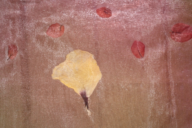
For this piece I sought multi dyed organza and decided to fuse two pieces together with legacy fusible with real bougainvillea and hibiscus petals sandwiched between the layers. The new fabric is quite firm and plastic like but was very easy to cut and work with. The petals were placed randomly with the larger hibiscus petals at the bottom to balance the flowers. This resulted in a pleasing arrangement which is experimental but I could see being used for a special costume top or as wearable art. The petals may eventually lose their colour I will have to wait and see.


New Capsule Collection Piece Six
For the final new capsule collection piece I took another ‘op shop’ white cotton shirt and after soaking in soda ash I procion fibre reactive dyed using diluted yellow and an orange dye. The dye was applied randomly. I decided I wanted to see how the shirt could be used for cutout work.


 I decided to apply iron on stabiliser to a section of the shirt and to see what effect I could achieve by cutting out the petal shapes but in a more elongated way to assist with successful hand stitching. I then removed the stabiliser after I had hand stitched around the hole I had cut. Next I selected some netting and adhered this to the back of the shirt using fusible to achieve the effect I was after. I might add I am not a real sewer so if the garment was going to be worn often I would need to design a more robust method to attach the netting. I could have done further work with more holes but time is running out so I have used the above to enable the effect to be seen. I am happy with this work as a prototype experimental piece but would like to see the idea taken further into a completed garment.
Analysis
I have been very challenged in completing these pieces because my father passed away early last month and then my stepdaughter last week. It has been very hard to focus but I remain determined to finish my revisions and submit to assessment.
I feel that in these six new pieces I have been innovative in my approach to the collection. I have used a variety of techniques in my attempt to be experimental. Some pieces are more successful than others. I think piece 2 is rather bland and could have benefited from having the petal pieces appliquéd to the organza as opposed to the background fabric I think this would have created a more interesting and successful piece. Piece One is balanced and wearable and the cut work adds interest to the shirt because of the texture and shape and the subtle dyed fabric underneath. I also think that Piece 6 has lots of potential for a wearable garment and I like the interest created by the cutwork and netting combination. On reflection I think I responded best when I was working with a real garment and that is something for me to remember as I go forward with my overall course.
I have taken my design ideas which are reflected in my sketchbook to be submitted for Assessment in an experimental way. It would be so possible to take this work much further and add designs to existing clothes and to create stand alone art pieces. I have attended the World of Wearable Art Show in Wellington, New Zealand on a number of occasions when I was living there and the works are amazing and cover a huge range of materials and techniques.
Revised 5.3 part 2 – Hand Stitched Samples
Overview
Having undertaken my analysis of my initial 5.3 and my decision to focus on one or two approaches rather than many I decided to focus further on the shapes from the bourganvillea flower and leaves. I was drawn to my work in Part 2 Assign 2 Part 2 Project2 Ex 2.3 of seed pods using cutwork/insertion type stitching. The reason I was drawn to this approach was that my sample in Part 2 depicted fragility and semi transparency. The bougainvillea petals are fragile and easily torn so this approach appealed to me for further sampling. It also influenced by my Archive Item in Project 1 The Christening Gown Project 1 Exercise 1.2 Substance 3. The Gown has a net overlay with embroidered/lace.
I reviewed my colour palette samples Revised Colour Palette – Colour Collage Part 5.2 and decided to continue with a similar colour palette to sample 5.2.3 the apricot/orangey/creams and trying a little blue/green. These colours were inspired by the bougainvillea bushes in my Tropical Tourist living collage and the colours of the fading/dyeing hibiscus flowers used as inspiration in 5.2.9Part 5 Project 2, 2.4 Develop yarn and linear concepts.
Hand Stitched Samples
What I did.
I decided for my revised 5.3 to work a series of samples using natural/apricots and some green blue colour fabric and orange/apricot and cream threads. The fabrics and papers used in the sample were mainly semi transparent or translucent. I have in mind that these may be used in work influenced by my experiments in the revised 5.3 printed samples. I thought about how I could play further with my lacy type insertion stitching using the bougainvillea petal shape as the cutout. I did not consult a Stitch Method Book rather I just depicted my thoughts using free stitching.
Revised 5.3 Hand Stitched Experimental Samples
I did nine samples each using different materials. The aim being to see the potential of the various materials with the stitch.

Revised 5.3. sample 16 (handstitch) – I used a medium weight linen for this first sample and cut out the shape of the petal. I used two different weight threads to do an overcast type stitch on the edge of each cutout. The thick thread stood out dramatically and the thinner thread melded more with the linen. For the weight of the linen I thought the thick thread was more successful and sat better on the linen.
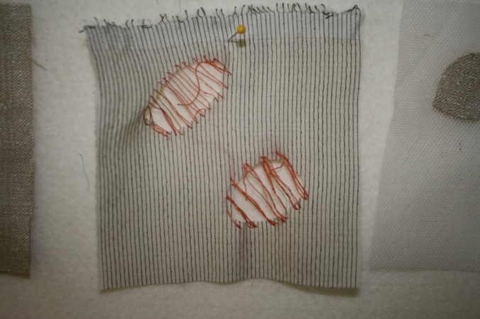
Revised 5.3 sample17(hand stitch) for this sample I used a thin fabric I am not sure if it is a cotton voile and cut out the petals. I used a fine cotton orange thread on the top cutout I used single thread and on the bottom double thread. The single thread worked far better and sat with the weight of the fabric well.

Revised 5.3 sample18(applique)
Rather than waste the removed petal shape I decided to appliqué thus creating a type of negative and positive effect to see if I wanted to use both or one of these approaches in future work. In the above sample 18 I used netting and in the top petal I hand stitched the linen petal and in the bottom I used the machine to stitch the petal. The hand stitch one worked better and sat on the netting better. Even though the linen was a medium weight fabric it sat on the netting well. The effect is like petals floating in the breeze.

Revised 5.3. sample 19 – For this sample I tried silk organza and appliquéd the two petals created from the cutout of Sample 17. I hand stitched both petals and the effect to me was once again like petals floating with the sheerness of the organza making this effect more marked than Sample 18.
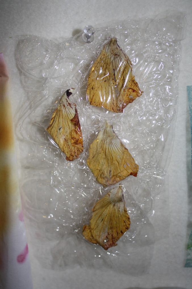
Revised 5.3 Sample 20 – I used the cellophane melted to capture the real hibiscus petals. Partly I did this because I loved the colours of the dead petals – the variations in colour and the lines of the petals and wanted to capture this effect for further consideration.

Revised 5.3. Sample 21- I painted a piece of thick tracing paper with red watercolour and cut out the petal shapes. I stitched using a single pearl 8 thread in orange and left one unstitched for contrast. The paper worked well the effect was interesting as the paper buckled and this created areas of darker and lighter colour and texture too. The stitching was ‘spidery’ and light.
Revised 5.3 – Sample 22 – For this experimental sample I coloured a teabag using procion dye. I folded the teabag to create interesting lines in the dyeing process. Given the amount of activity with the coloured surface of the teabag I chose to do free style hand stitching just down the centre of the cutout petal shape. I really think though that the dyeing effects on the teabag take away from the petal and the stitching and are busy for the type of effect I was trying to create with more emphasis on the petal.
Revised 5.3 – sample 23 This time I experimented with light lutradur which I coloured blue green with acrylic paint. I love the web type surface of the light lutradur. I chose to stitch with a orange brown pearl 12 thread and for the second petal I left blank (this may be useful to have a blank one for further experimentation). I think the thread is too thick the stitch design I like but a lighter finer thread would work better to create the ethereal fragile type quality I was seeking in the experiment.

Revised 5.3 sample 24 – For this piece I coloured using acrylic paint a piece of medium weight lutradur and also for more interest used copper textile ink to print some circular type shapes using a toilet roll. I half cut the circles to see if this effect was interesting or had potential for further use. I was not so keen so decided to add some stitching as well to create more interest. This time I chose a fine thread doubled. I do not like the choice of thread it does not work in colour or weight. A copper colour thread may have worked better and a better stitch design.
Analysis
I think I like the experiments with the cutout petal work as indicated under each Sample some work better than others. Taking the concept forward I see potential to use this type of approach in larger work with a printed fabric underneath. It goes back to the Christening Robe I used in my Archive Collection in Project 1Project 1 Exercise 1.2 Substance 3 which has a netting overlay with lace type embroidered work.
REFLECTION on initial Project 5.3
I have first analysed the work I have done for the initial Project 5.3 Part 5 Project 3 Experimenting and Taking Risks and noted that I worked with the following techniques:
Back Printing on fabric – Samples 2B, 3.4, 4.1 and 8
Painting on fabric– Sample 8
Inktense blocks on fabric – Samples 5, 6
Gelliprinting – Samples 2A, 3.1, 4.2
Monoprinting using laminated paper – on fabric – Sample 3.2
Hand printing – Samples 2C, 3.2
Rubbing – Sample 1
Reflecting on this initial Part 5.3 I see that I have used too many techniques with little extending of the sampling. This means that I lacked depth in my experimenting and fallen back on what I have done before unlike Part 5 Project 1 where I extended my sampling on Georgia O’Keeffe . This is consistent with my Tutor’s Feedback on the lack of a large number of samples to chose from to take my work forward into the Textile Capsule samples.
Relooking at my work for initial 5.3 I reflected that my work is not organised as well as it could be. I did not have a structured way to undertake the experimental samples and this is why I think I ended up using superficially so many techniques. I also had no consistent approach to evaluating or reflecting on the samples. I could improve my links/joins to previous work too and my labelling of samples too.
WAY FORWARD NOW
I am redoing my Samples for 5.3 using a limited number of techniques in much more depth with the intention of producing a large number of samples. This revised approach assists me with being more experimental and inventive – to push the boundaries, make discoveries. I will reflect on my experience thinking about how I could take the ideas forward, build on what I have done, what I could do differently. I will then select the best samples to assist me in developing my new Textile Capsule.
REVISED 5.3. PRINTED SAMPLES
OVERVIEW
I bought a Gelli Plate which has a unique surface for mono printing without a press. It is a simple process whereby you apply paint to the plate and roll with a soft rubber brayer. It is possible to make your own gelatine plate too but the advantage of the Gelli Plate is that it can be used over and over again whereas the homemade gelatine plate breaks up (producing some interesting effects though).
Following my analysis above I have decided for these revised samples to concentrate on the Gelli Plate printing for Project 5.3. and Stitched Samples (in a separate blog post).
My Goal
The Equipment used is:
Gelli Plate A4 size
Palette paper to mix colour using the brayer
Brayer
Water Bottle
Paper or Fabric
Textile Printing Ink (Permaset)
The Mark Making Tools include:
Stencil and Masks
Subtractive items to remove paint from the plate
Additive tools to coat with wet paint and press onto the Gelli Plate


Gelli Plate Permaset Textile Ink and a brayer
What I did
I took time to select a vary of fabrics to use in the printing this included pfd kona cotton, cotton organza, cheesecloth, light lutrador, tissutex. I did not use canvas as I had in my initial 5.3 samples as I wanted to achieve a softer effect. I cut out the fabric samples to the size of the A4 Gelli Plate. I made some stamps using cardboard and sticky foam and sponge.


Stamps – cardboard and adhesive foam. The shapes inspired by
bouganvillea bush.


Stamp adhesive foam Plastic grid Sponge bouganvillea petal and leaf
Samples
What I learnt
I was disappointed with the vibrancy of the textile ink transfer to the fabrics in some cases. The subtlety does not show as well in photographs for the semi sheer fabrics which is frustrating. I liked the way the layering gives more interest and possibilities to the fabrics. The fabrics create ideas for stitch or collage. I learnt it is important to be organised with the fabrics ready and my printing table set out with all I need in advance.
I found that it was best to apply textile ink with a foam brayer to the handmade adhesive foam stamps before printing as opposed to rolling out the ink and placing the adhesive stamp in and then printing.
The time put into making stamps, stencils and finding recycled materials to use for mark making is well worth the time and effort in advance. I liked the way the multi printed pieces worked (Samples 5.3.11, 5.3.12 and 5.3.15) using stamps and masks.
I tried a variety of fabrics, with the semi transparent including organza, light lutrador (which is a man made fabric), tissutex(strong paper) and a type of cheesecloth. I also did a number of samples using pdf cotton. I chose the pdf cotton to see if it improved the vibrancy of the colour transferred to the fabric but I do not think it made any difference and the paint did not sink into this cotton which is a high thread count primatex. The handle of the fabric was good with the textile ink which is an Australian product called Permaset it is not plastic like nor is it sticky. I liked the effect that was achieved on the organza and lutrador it has reasonable colour retained on the surface and offers opportunities to be layered over thicker fabrics for interesting effects.
Based on my printing samples I think the mid to deeper tones work better with fabric using the gelliplate(samples 5.3.5, 5.3.6, 5.3.9 and 5.3.11) because they show up the layers better.
I also learnt that my subtle colour choices were not as well captured in photographs. This is something I need to be aware of in the future when submitting work digitally to OCA.
Samples


Sample 5.3.1 handmade stamp Sample 5.3.2 handmade stamp on
on cheesecloth – layered on light lutrador – layered


Sample 5.3.3 handmade stamp Sample 5.3.4 handmade stamp
on Tissutex paper layered on cotton organza layered


Sample 5.3.5 handmade stamp Sample 5.3.6 handmade stamp
on pfd cotton – layered on pfd cotton – layered


5.3.7Mixed paint and stamps on 5.3.8 Mixed stamps and stencils on
fine latrador multi layers pfd cotton multilayers


5.3.9 sponge stamping on 5.3.10 sponge stamping and cord
on pdf cotton layered on pdf cotton multilayered


5.3.10 stamps 5.3.11 sponge leaves on pdf cotton – layers


5.3.11 recycled plastic grate used 5.3.12 plastic circle part of old
as stencil and sponge petal cotton vacuum cleaner pdf cotton


Sample 5.3.13 petal sponge Sample 5.3.14 ghost print
on pdf cotton multiple layers on pdf cotton one layer

Sample 5.3.15 multiple layers – plastic recoiled vacuum cleaner part, string on pdf cotton
Analysis
I was curious to see how well the Gelli Plate worked with textiles (I have used with paper particularly Bank Paper very effectively) using textile printing ink. I was very happy with the hand of the textile ink(Permaset) as stated above it was not plastic like nor sticky on the fabric. I was less happy with the transfer of the ink to the fabric in several cases (Samples 5.3.14, 5.3.10 and 5.3.8 for example). I think I did not use enough ink in these cases and I also think the Gelli Plate works better in the initial layering by placing the ink directly on the Plate and then brayering it rather than brayering on palette paper first and then using the brayer on the Plate. I think the samples are a bit organic but this could offer opportunities as a background for further layering and stitch or collage.
In future I would like to do further work comparing mono printing on fabric using the same textile ink but using a plate made from a laminated piece of paper time does not permit me to continue with that for this sampling. I wonder if the ink on the laminated paper will transfer more opaquely and not have the more interesting textured qualities of the Gelli Plate.
Did I achieve my Goal?
I had fun making the samples and built on my experience of working with a Gelli Plate. I did not achieve wondrous works but I was happy with some samples and with the semi transparent samples. I can see that there is tremendous advantage in keeping an organised Sample Book with notations. This would be a valuable resource for future work. It would force me to be more orderly in my approach and not rush ahead and then wonder how I achieved a particular outcome. I do not think the prints are a completed work and therefore I am doing further samples using stitch on other materials still influenced by my tropical flower petals with the idea of melding the printing and stitch together in my revised Textile Capsule.
I have prepared a Plan of Action based on my Tutor’s Formative Feedback on Part 5.
ACTION PLAN for Revised Assignment Five
Learning Log (Tutor: overall well organised and I demonstrate the ability to take on information and learn from it). However Tutor points out I need to put some of my new knowledge into practice.
To DO
Action 1: Further develop collage samples in Part 5.2 – analyse, reflect and document outputs. Add some answers!
Action 2: Following my Formative Feedback I have decided to redo my samples for 5.3 Experimenting and taking risks. Undertake detailed critical reflection as I progress through samples. Do far more samples, less techniques more focused go in deeper be innovative see potential have a framework for carrying out Action 2. A framework or system will help me to focus (I have problem with this which is obvious when you see how many different techniques I have used but only superficially) define and consider my work.
Research (Tutor: have started my analysis of my research with Holmes and Lyddon but in Assignment Five I have been giving general information on Artists selected).
TO DO
ACTION 3: Revisit some of the artists in Part 5 and analyse and evaluate in more detail as suggested by Tutor.
Sketchbooks
TO DO
ACTION 4: Do far far more printing samples which will help me to have a wide choice to take forward into final textile samples. Part 5.3.
Engagement with Textile Techniques(Tutor: Noted she had only seen my textile samples digitally. Liked my colour palette and saw variety in my compositions and noted that there is evidence I have pulled together things I have learnt from previous assignments to create the work.)
TO DO
ACTION 5: Do another more developed Textile capsule collection with the aim of creating innovative and exciting work.
Reflection
I produced an initial colour collage to investigate colour which I then used as a base for my initial 5.3 and less developed Textile Capsule. Following my Tutor’s Feedback I realise that I did not extend my analysis of this collage and nor did I take it further with other colour collages to choose from. My Tutor has raised some questions, for example, what did I learn from the collage? Was the colour balance right?
Revised Approach
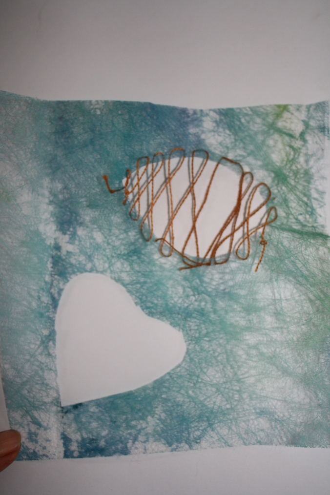
To proceed further I have reproduced the first Colour Collage(colour collage 5.2.1) below: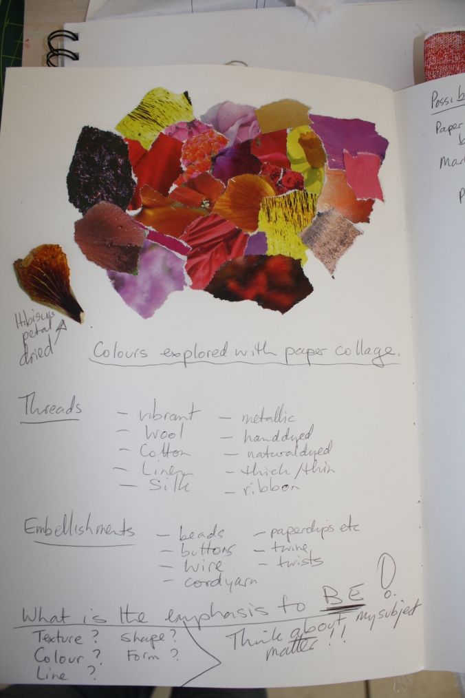
In looking at this collage I thought it had too many colours even though it reflected many of the colours in my Tropical Tourist installation. I thought it was too busy. I thought the yellow stood out but the plants I was particularly focusing on – the orange/apricot bougainvillea flowers and petals and the hibiscus and partially dead hibiscus flowers were more subtle in colour. I thought of examine several other palettes in my revision of sections of Part 5 so I developed the following palettes: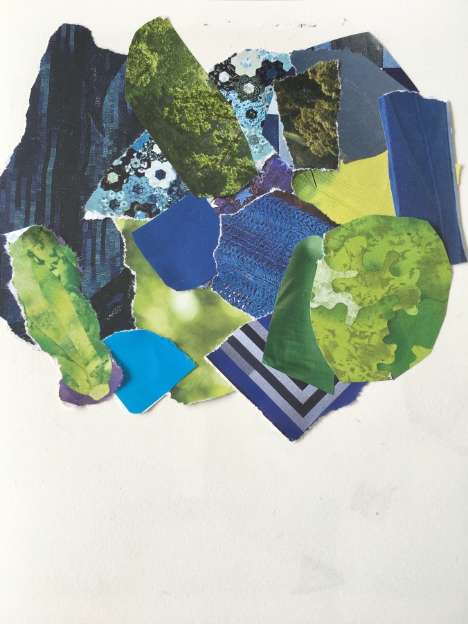 Colour Collage 5.2. 2 – This is a cool colour collage using the tropical greens and the deep blues of the ocean. I love these colours but they do not fit with my study of the petals and flowers of the tropical flower plants. If I wanted to extend my study to include a lot of foliage the green would be helpful to match.
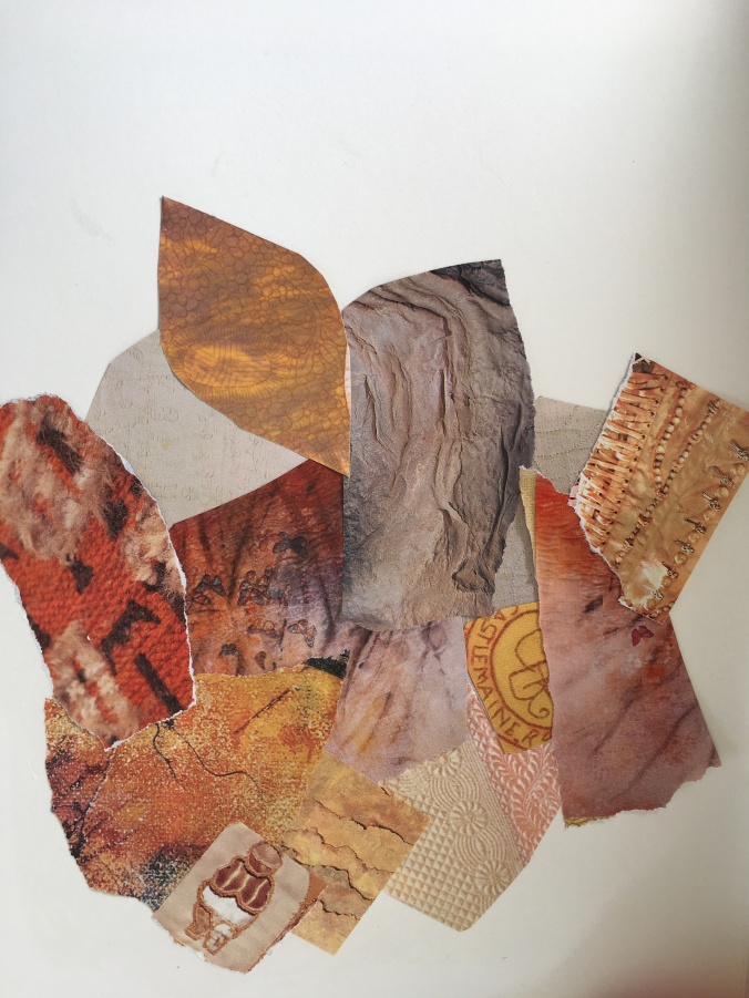
 Colour Collage 5.2.3 – more neutral colours with a touch of earthy colour. This colour scheme did not really fit with my theme of Tropical Tourist it to me more depicts the after effects of a bushfire or an industrial theme.
 Colour Collage 5.2.4 – these warm apricot, rusty colours more reflected the colours of the flower petals and flower of the bougainvillea and hibiscus. It captures the various shades of colour I have seen in the flower petals and the ageing and decay of the flowers. It conveys fragility to me. It is more subtle than the bright primary colours of collages 1 and 2.
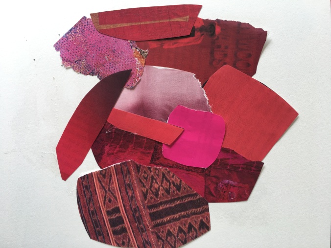 Colour Collage 5.2.5 – I reflected on my work in Part 5 Project 1 and the use of red by the artist Georgia O’Keeffe and decided to add a red collage to see what I might learn. This colour is very vibrant and dense – lovely – but does not reflect the fragility of the petals I have been studying. However, I could use these red shades if I wanted to pursue Part 5 Project 1 drawings and printing.
I have carefully read the final formative feedback document from my Tutor. I have identified from this Feedback further work I need to undertake for this course before I submit for Assessment.
My Tutor commented overall that I had clearly worked hard during this part of the course but that my final samples reflected the pressure of trying to get things right and hence a safer approach. My Tutor advised that it is important at assessment that the student has taken an innovative and engaging approach and that demonstrates an ability to take risks. In addition the Tutor has noted that I have not used my analytical skills to examine in depth my earlier samples and some of my research material. My Tutor noted that I had a pleasing colour palette and provided evidence that I have pulled together things that I have learnt from the previous assignments to create my Part 5 work. My drawings were interesting particularly those inspired by Georgia O’Keeffe paintings.
I have pondered at length this overall feedback and feel in myself that I could have been more innovative and experimental. I also think that I rushed my final samples and whilst being self critical I have not documented that appropriately. I could have documented more extensively my initial sampling in Part 5 particularly what I think of the results. As I used print in my less developed samples I should have made a larger body of expressive sketches to draw from I understand this but for various reasons I was rushing. This means I need to establish a better framework to approach my study work in general to ensure I develop in more depth and document in more detail. This would then ensure I can pick the best of my samples and not rely on a small number.
I was pleased that my Tutor found my drawings interesting particularly the way I approached Georgia O’Keeffe paintings and she could see that I have been practising. Drawing has been a challenge for me so I took heart from these comments.
So I have developed a detailed Action Plan and documentation approach. I will present this material by way of acting on my Tutor’s feedback and my carrying out some deeper analysis of my research which will lead to a new collection of work. I will be careful to record in detail the processes, my evaluation and subsequent ideas in my learning log finishing with a more general reflection. All work including the less developed capsule collection will be send in for Assessment.
I have really enjoyed Part Five of the Course because I had a sense of things coming together for me. I found my drawing improving with this being a major challenge for me at the beginning of the Course. I understood how to drill down on a theme and focus on a few elements and the ideas kept coming and still are coming. Importantly I found I had more organisation and structure to my work. I think the analysis at the end of Part 4 on “A Structured Approach to Reflective Thinking” leaning heavily on the work of Cottrell(2011,p211)help me to approach Part Five in a more cohesive way.
The model I presented of critical reflection encouraged me to do a “Review of Formative Feedback”(blogpost March 30, 2017) for assignments 1, 2 and 3, for example the question I posed to myself in terms of Assignment One Feedback “Have I looked hard at other practioner’s work and fed that into my own practice? provided me with a prompt as I commenced Part 5 to ensure I documented my Research of other Practioner’s who I was drawn to (e.g. Dorothy Caldwell, Bobby Britnell). The reminder to draw in a range of mediums, to draw without looking on large A2 paper all were highlighted to me. I also did an update of the book “Steal like an Artist”. The review of the feedback from Assignment Two also encouraged me to include more photographs from my sketchbook,and to use to water soluble crayons and other materials. I took on board the feedback from Assignment Four also and revisited Debbie Lyddon’s Book and provided more in-depth analysis.
In terms of my Model which is a continuous loop Model I followed along on the Acting and Experience by research gathering and documenting this, by preparing a portfolio of work. I reflected on my previous creative experience in Assignments 1,2,3 and 4 and my current experience. I tried to integrate my reflections with ideas and approaches by other artists and I think I achieved this at least to be influenced by Caldwell, Britnell, Blake and Streefkerk in Part 5. Review and Assessment I will comment further below and finally evaluating in terms of my development.
Overall for Part 5 I have had a shift in my thinking about my textile work. For the first time I feel a deeper relationship to my subject matter to what I am doing and how I am doing it in some way it feels part of me. It is not just a selection of techniques it is more than that. I have also come to value the use of the sketchbook (I have to confess I was trained by a master US quilter to work intuitively with no sketchbook)as my place to sort out ideas and experiment I still have work to do though. I think I better managed my time in Part 5 but there is still room for improvement. I understand so much better now what I need to do than when I started the course.
The course in general has provided so much to me in way of my textile work. I feel so enriched by the experience. I now approach my work from a deeper mindset. This has had a very positive effect on my other textile work outside of this course. I plan to enrol in the Mixed Media in Textiles Course next. I will enter Exhibitions also (I have done this already) but be more experimental and less risk adverse with my approach. The course has stimulated me to think of textiles far more broadly and I look forward to expanding in this context further.
